Nexthink’s Platform Gets a Facelift
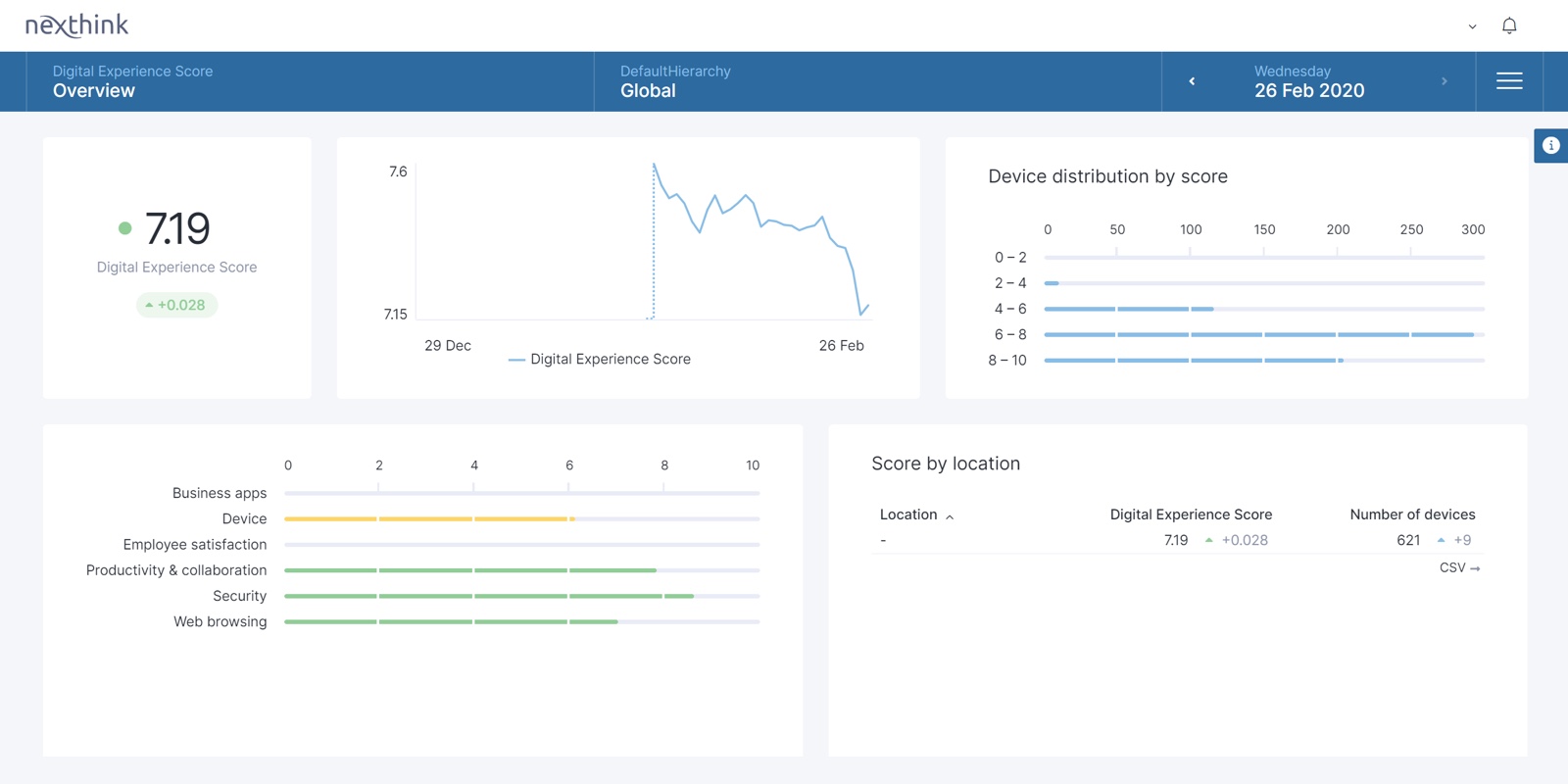
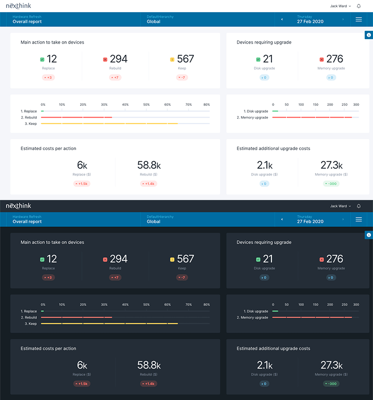
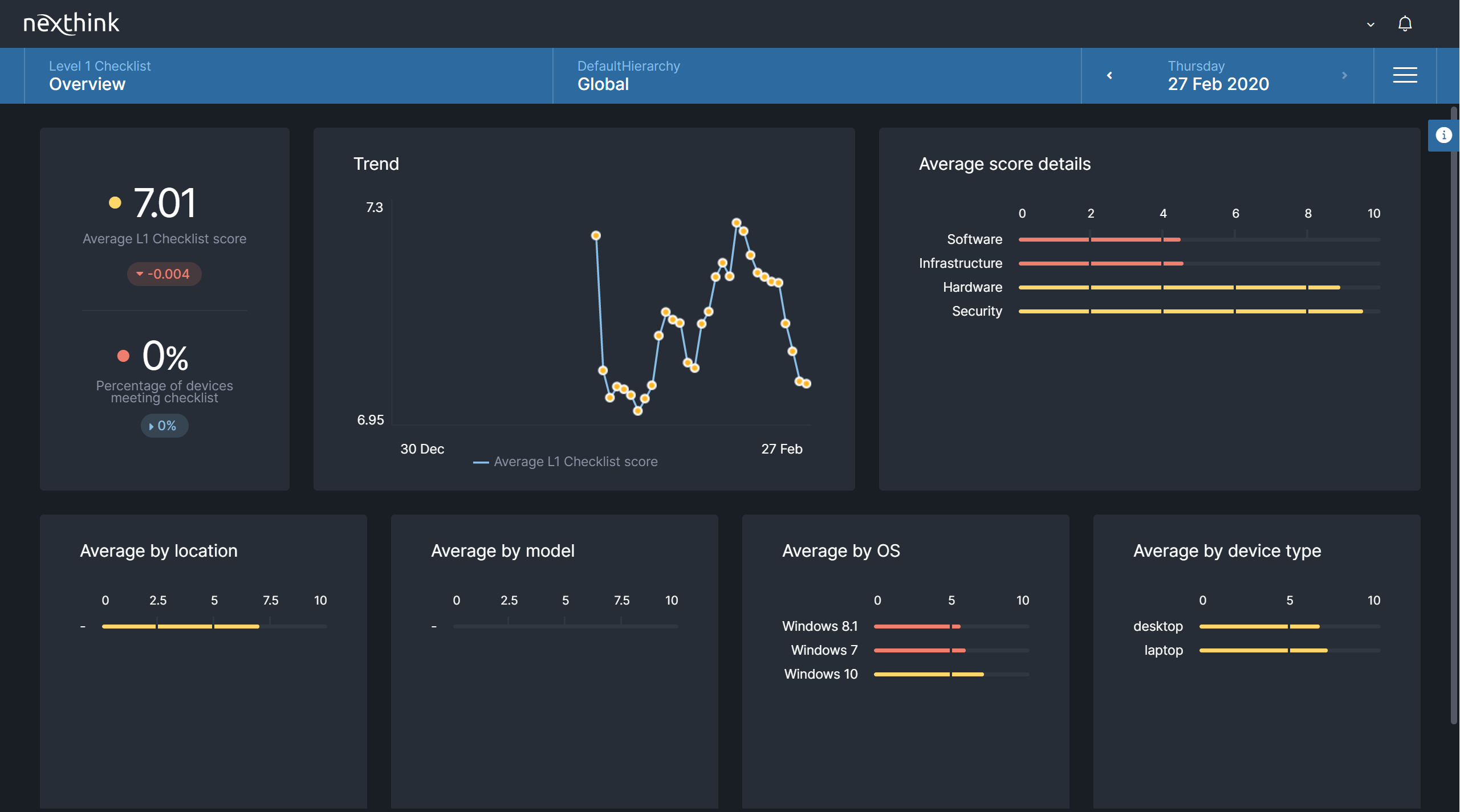
Nexthink is proud to announce our UI has a new and improved look. We feel confident that this change adds to the philosophy we preach here at Nexthink: to delight people at work.
Aside from the visual improvement, this update also signals a new era for the Nexthink platform.

The first prototype for this new UI was released back in July 2019. Aptly named “Apollo”, we wanted to pay homage to the 50th anniversary of the first man on the moon.
“It just made sense. We were ambitious and we shot for the moon with this project” proudly explained Patrick Hertzog, Co-Founder and UX Officer at Nexthink.
A practical, sleek look & feel
Taking our appreciation for the employee experience to heart, we wanted to build a UI that IT teams would enjoy using, something that would make them more productive and engaged in their work.
Our brilliant engineers were able to turn this dream into reality, and we couldn’t be more excited for our customers.
“
We want to improve the product’s user experience and deliver something more delightful, a high-quality digital experience.
Eduardo de la Roque
Senior Designer, Nexthink
To that end, a new visual language was developed to give users a contemporary and intuitive look and feel. Indeed, beyond a refreshed typeface, color scheme and button layout, a lot of thought was put into more practical and vibrant dashboards. For instance, Apollo’s polished grid structure organizes information in a more digestible manner and adapts to different screen sizes or usage scenarios. In addition, the layout is more accessible for users with varying visual needs, such as color-blindness or for those that require low-luminosity workspaces.

Style backed by power
Apollo is more than just a “new coat of paint”. It’s an intricate design system that, from a back-end perspective, is driven by some seriously powerful tech.
“
Apollo is much more than just a new design. What we’ve put in place will truly accelerate the development of new features.
Gorica Tapandjieva
Product Manager, Nexthink
Of course, Nexthink always has been—and always will be—powered by high-tech. But Apollo offers customers a sleek product cover that warrants the same amount of detail and creativity that went into the technology that sits beneath it.

A new era
Ultimately, with this new look, Nexthink will be able to better streamline and optimize the release of new ideas and product features and empower users to more confidently manage their companies’ digital experience.
“
You know, Apollo wasn’t really developed to keep the Nexthink spirit, but rather to define it for the future.
Patrick Hertzog
Co-Founder and UX Officer, Nexthink
Interested in seeing Nexthink in action?
Book a demo now
Related posts:
- Building better information dashboards in an easier way
- The DEX Show | Podcast #7 – A Human Approach to the Future of Work w/ Paul Hardy
- The DEX Show | Podcast #9 – The Three Magic Kings w/ Nexthink’s Founders
- The DEX Show | Podcast #8 – Remote-Work Wireheading w/ Tom Goodwin