Nexthink Further Enhances UI for Experience Platform
In February 2020, Nexthink introduced its new design system, Apollo. While it unveiled some great new accessibility and design features, its true raison d’être was everything happening on the back-end, a powerful new design engine to scale and accelerate the roll-out of new features.
Well, 6 months later and here we are.
As promised, this latest round of enhancements offers several intuitive modifications to make IT’s life easier when supporting the Digital Employee Experience. Here’s what’s new with the latest Apollo design features:
New navigation and organization
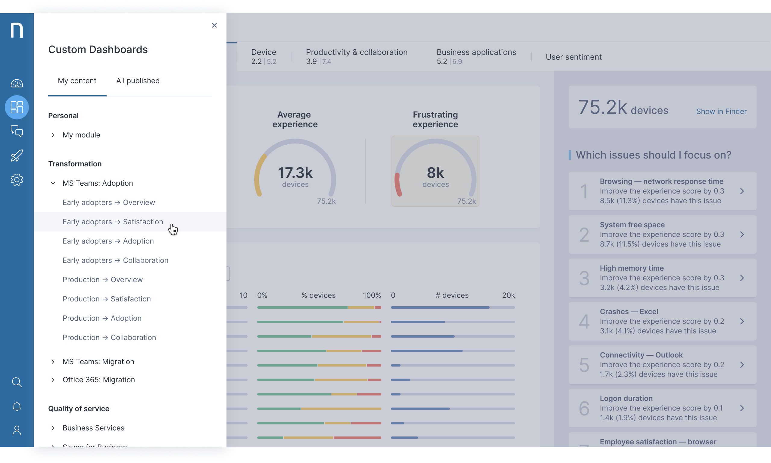
The most apparent and exciting change is the new navigation interface. A new vertical, left-side tray now frees up screen space with its sleek look. This allows users to easily jump to their different platform features and streamline access to actionable employee experience insights.

The tray opens up a more organized dashboard menu with an itemized, practical drop-down of action items IT can take. This intuitive design allows users to seamlessly navigate to and from their preferred dashboard and custom content.
Stronger Experience Optimization
Customers will also quickly discover an important new feature in their Experience Optimization dashboard.
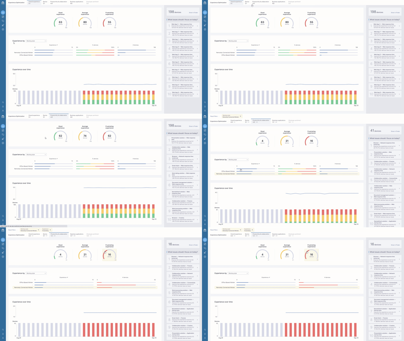
In addition to the Overall Experience view, users will now be able to navigate to 4 new dashboards for each of their DEX Score breakdowns: Device, Productivity and Collaboration, Business Applications, and Employee Sentiment.
This powerful new scoping capability allows additional filtering to assist IT with proactive investigations. Ultimately, this enhancement will improve the accuracy and speed in which IT teams can prioritize their remediation steps.

For example, let’s say IT wants to focus their attention on fixing underperforming Windows 10 Pro 1903 software for remote users in New York City. With Experience Optimization, they can drill down into their employees’ technical problems, and receive guided steps to remediate any critical issues.
All done in just a few clicks.
Sharper Engage Dashboard Filtering
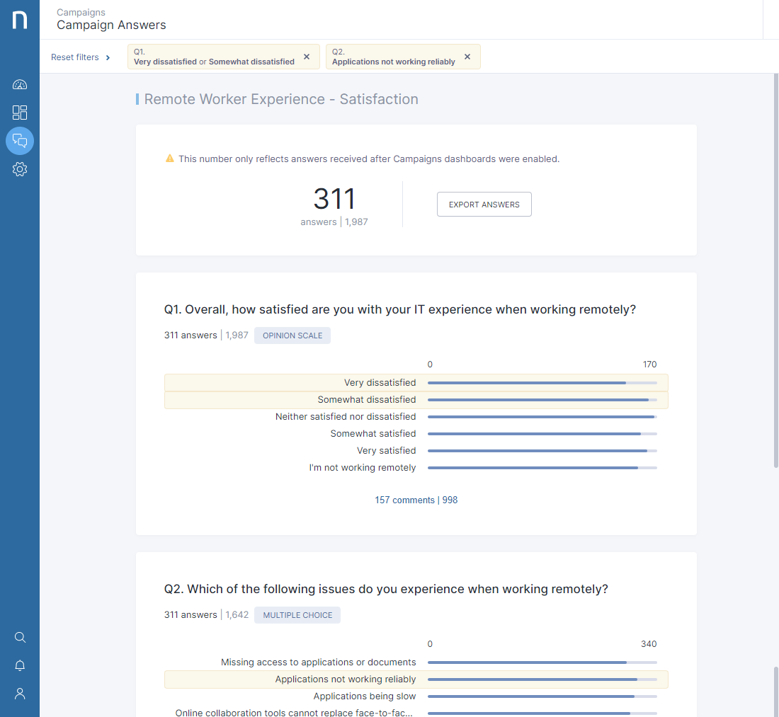
The Engage Campaign dashboard provides an automated report of each Engage campaign. Now, users can filter campaign results by answers to easily define any correlation between each question.

In the example above, IT filters for the results of a work-from-anywhere (WFA) satisfaction campaign to better understand employees that are experiencing application-related issues.
Change is coming
This is only the beginning. We have many new features and updates planned to help IT departments more efficiently manage their Digital Employee Experience.
Discover these new features in our latest release, coming out September 24th!
Not a customer yet? See Nexthink Experience in Action!
Related posts:
- Going Broad & Deep to Optimize Experience With The Newest Nexthink Release
- Experience Optimization – Virtualization, UX and Insight Upgrades in Latest Release
- The latest Nexthink Release is All About Proactive IT
- Let’s Break Down Marble Testing Redux-Observable Epics